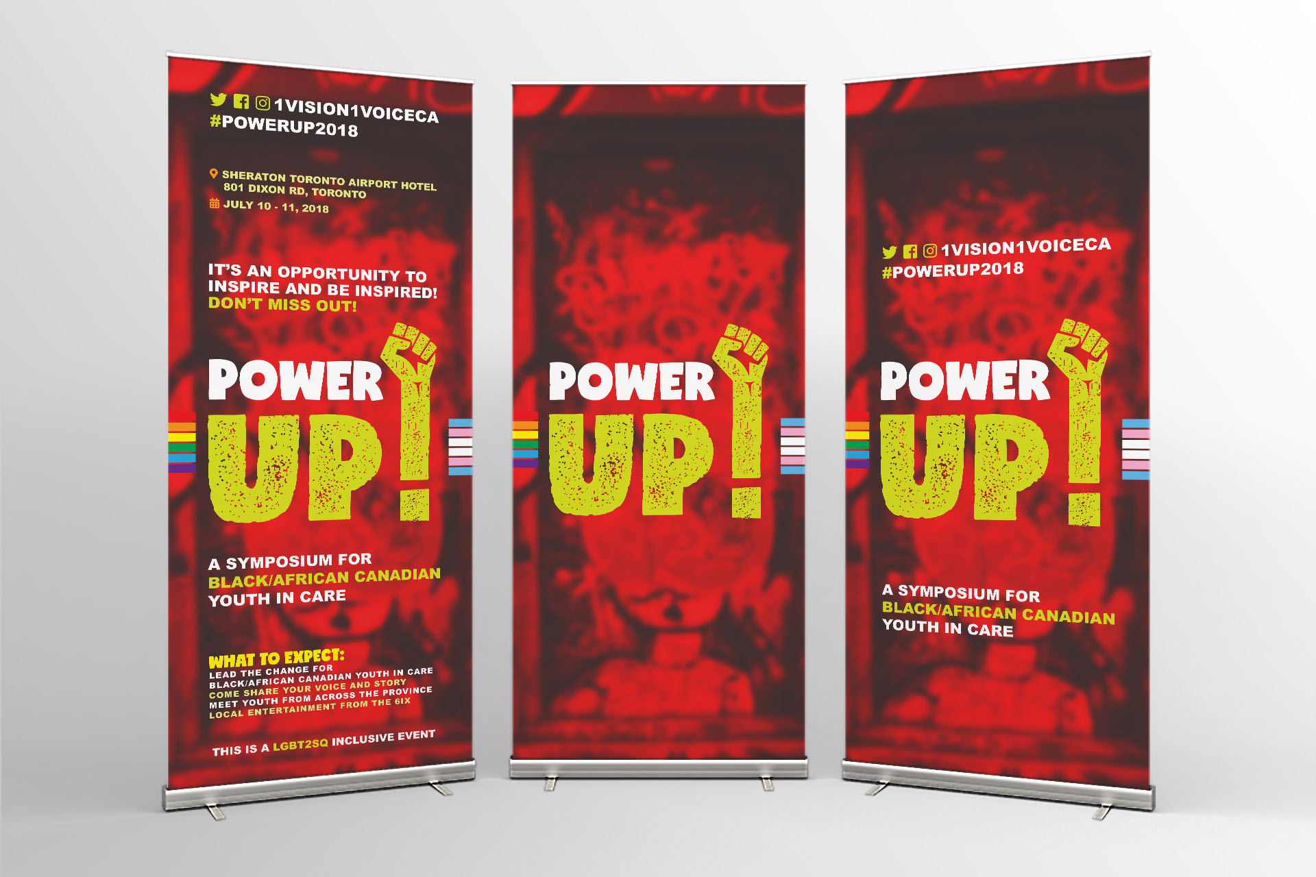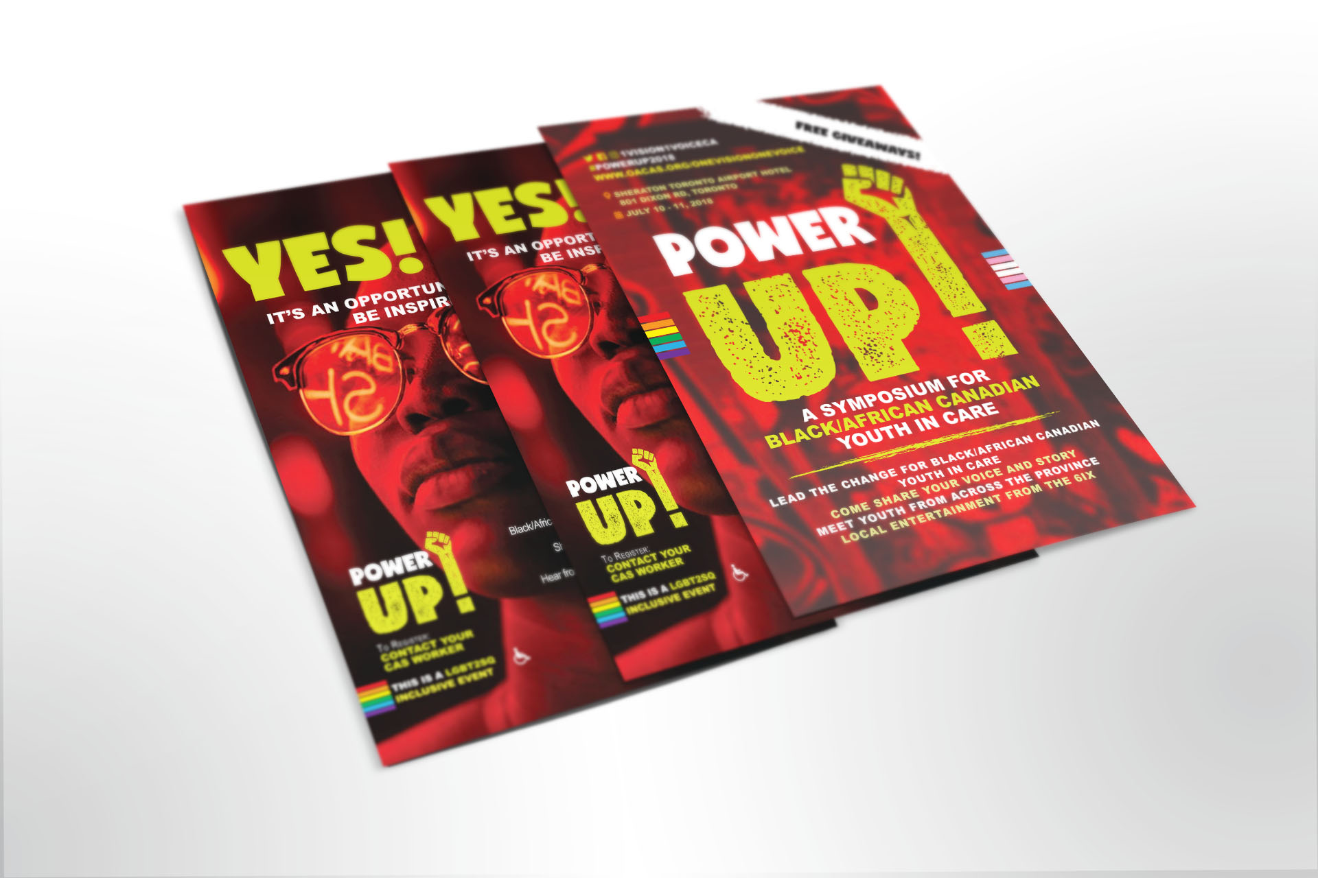

For the logotype, we were asked to use elements of black resistance – the Black Power fist, pan-African elements etc. – within the concept. We use a strong font, paired with a rock texture to show the strength and resilience that black youth and children in case build through their journey in the system. We included the Black Power fist into the exclamation mark of the logo.
For the main concept of this campaign, we used two main elements. The first is the photograph of a black youth, highlighted with red and black lighting. The second concept that we used was a red and black door. The colors red and black, plus the chartreuse used in the full logo drew from the colors of the Pan-African flag, as well as that of the Ghanaian flag.
The take home piece for the staff as well as for the youth in attendance was an agenda booklet. This piece was created highly visual, highly colorful, with a focus on providing the attendees with elements of their Black, Caribbean and African culture.


